Sona Benefits
Sector
Pharmacy Benefit Management
Services
Branding Refresh
Web Design
Marketing and Sales Materials
As Sona Benefits began to expand, they sought to establish a distinct identity that stood apart from their parent company while remaining connected to the Sona family.
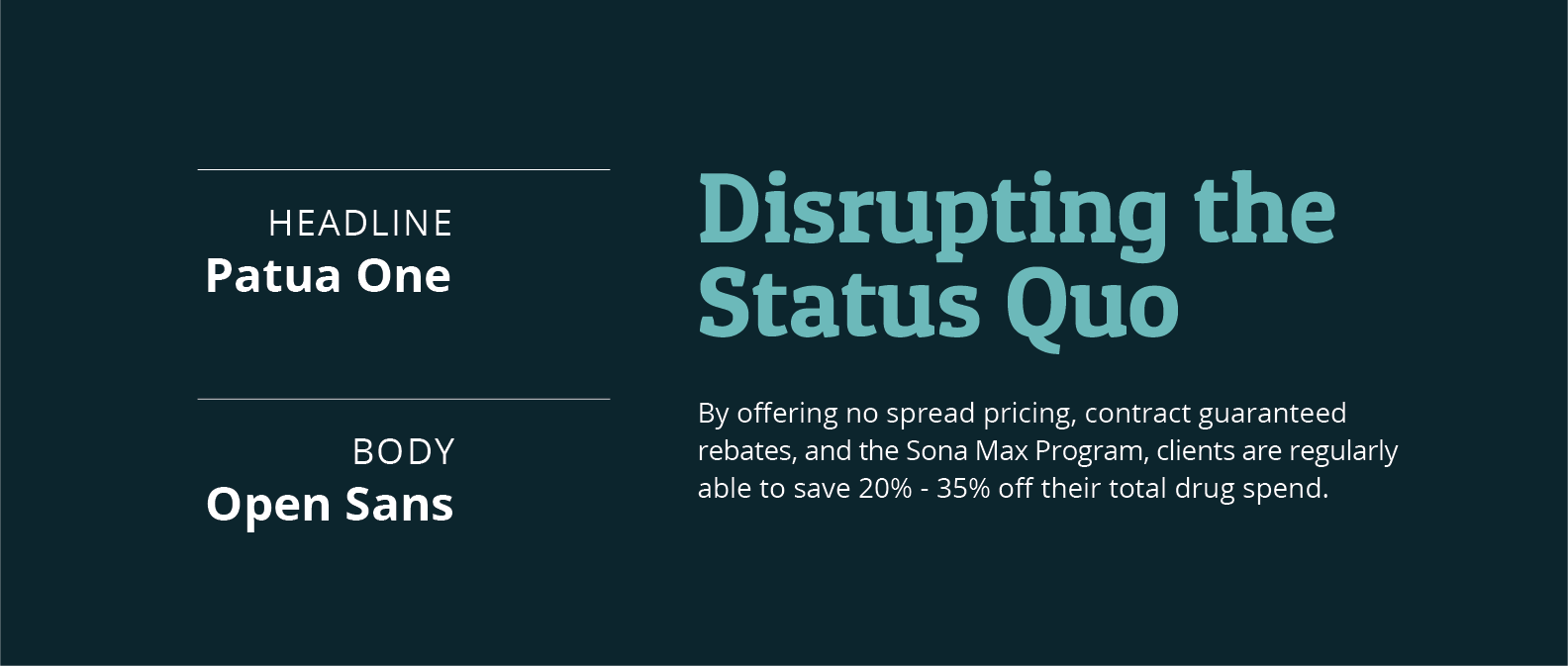
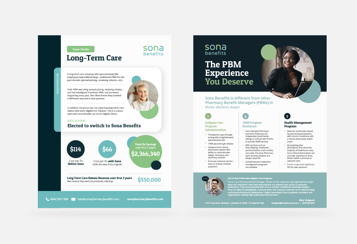
We were entrusted with refreshing their marketing materials and website to support this evolution. This included updating the color palette, typography, and expanding their design assets. A key addition was the introduction of a clean, playful bubble motif, which reflects their brand attributes of being genuine, fresh, and authentic.
The refreshed brand aesthetic not only reinforces their unique identity but also positions Sona Benefits as a bold disruptor in the industry, helping them stand out from competitors and resonate with their audience.
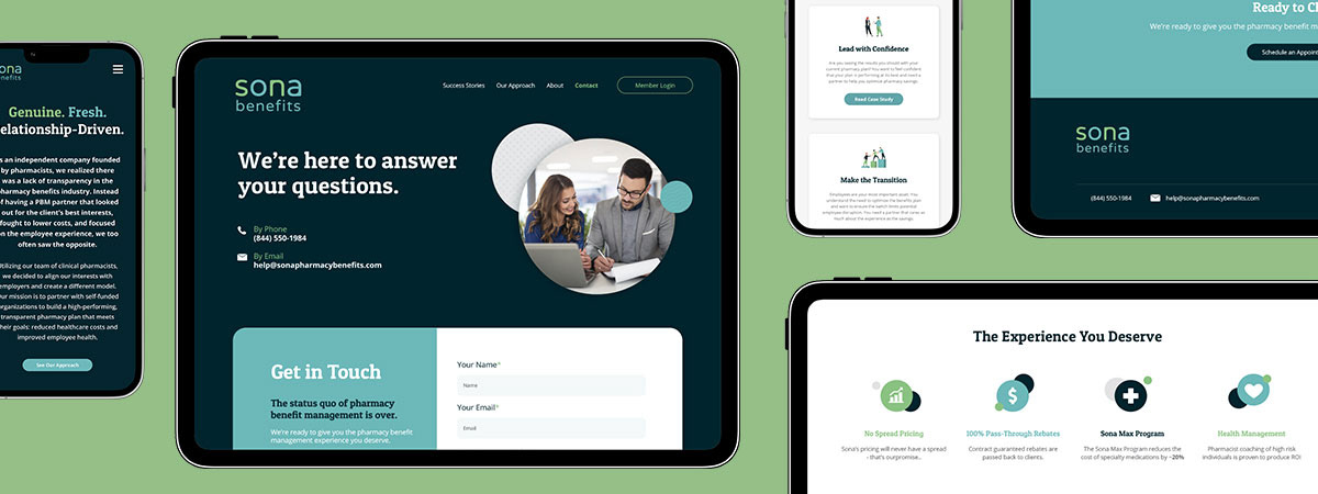
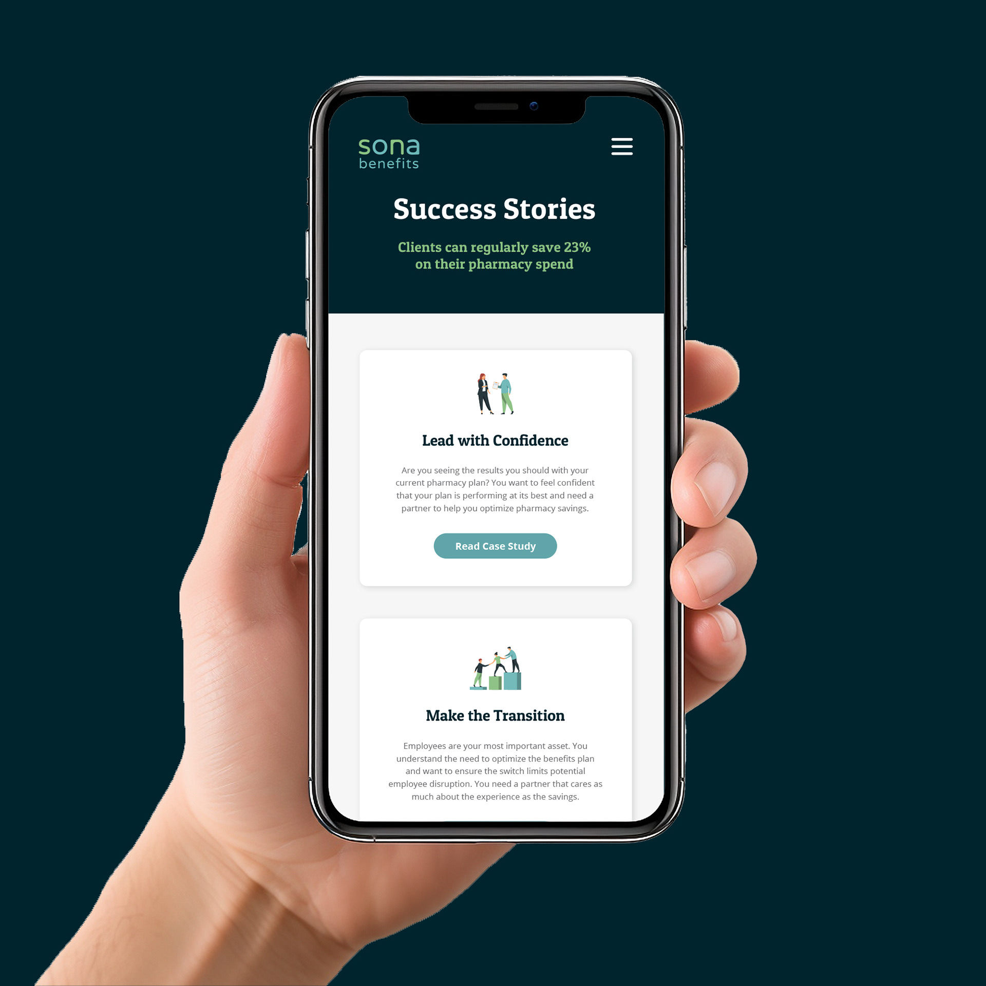
Website Design
Our mission was to give the Sona Benefits website a fresh, updated look that aligns with their newly rebranded identity. By incorporating key elements from their rebrand, we crafted a cohesive and modern design that elevates the Sona Benefits brand.
A key challenge was ensuring the site effectively addressed the needs of its diverse audience, guiding users to the right information quickly and intuitively. Our solution? A dynamic quiz embedded in the header. This interactive feature helps funnel visitors directly to the relevant sections of the Success Stories page, ensuring a seamless and engaging user experience.

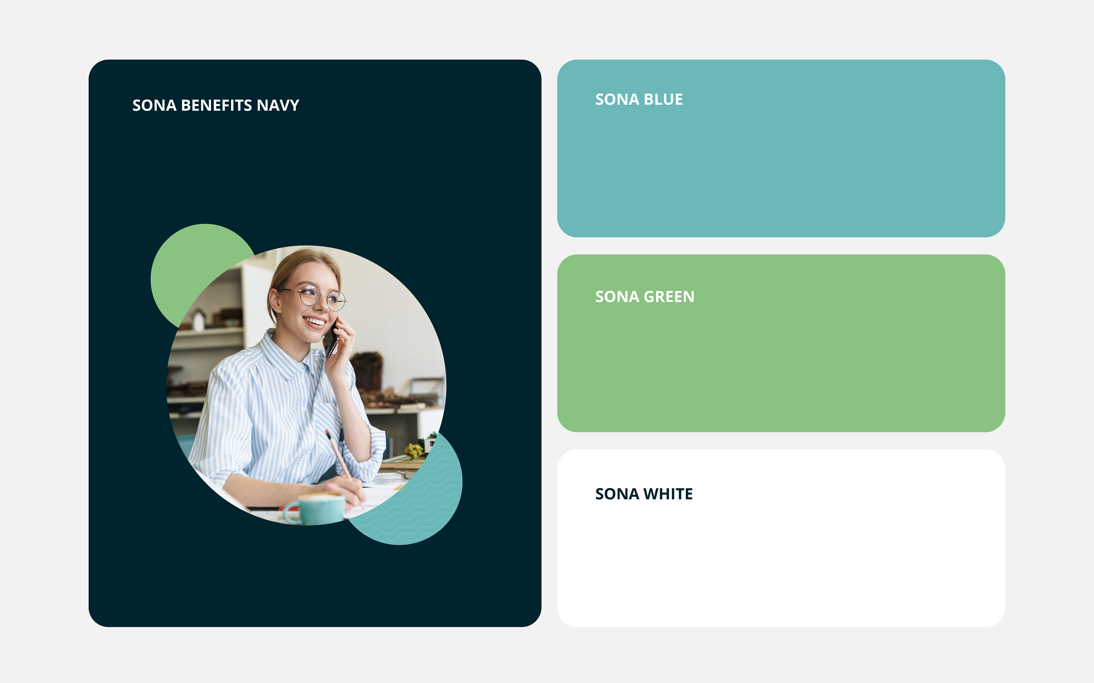
Brand Refresh
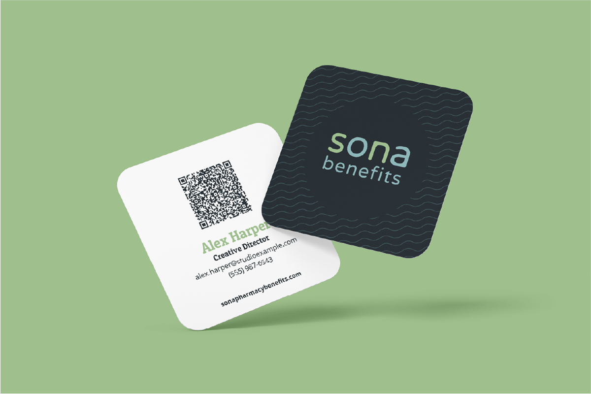
To distinguish Sona Benefits from its parent company while maintaining a visual connection, we refreshed the color palette with a bold, deep navy, complemented by the original green and blue brand colors. This approach provided a modern, distinctive look while honoring the umbrella brand’s identity.


Any exciting projects on the horizon or need a creative partner for ongoing design work?